
 Pottery Date Night
 Bring All Your Friends Free Week
 Give a Month of Pottery
 Private Pottery Parties

 The Welcome Booklet
 Your First Ten Sessions
 The Pottery Process
 Finding the Studio
 Your Classes Never Expire
 The Four Tables
 Who’s Who
 The Rewards Program
 Flux Glazes
 The Calculators
 Kiln Tracker
 Holiday Kiln Deadlines

 Beginner’s Tool Set
 Fingernail Clippers
 Mayco Clay Mender
 Epoxy for Kintsugi
 Applicator Bottles
 Large Bead Rack
 Raku Workshop
 Nighttime Raku
 Horsehair and Feather Raku
 The Clay Hole T-Shirt
 Embroidered Crewneck
 Zip-Up Hoodie
 Pre-Made Bisqueware
 Glaze Catchers
 Kiln Cookies
 Clay Cubby Rental
 The Glaze Bible, Printed
 The Book of Molds, Printed
 Printable Pottery Guides
 Free Printable Trackers
 Gifts for Potters
 Christmas Pottery Ideas
 Mother’s Day Gift Ideas
 Pottery Date Night
 Studio Calendar
 2027 Studio Events
 What Should I Do Today?
 How to Throw on the Pottery Wheel
 How to Make a Pinch Pot
 How to Tap Center a Pot
 The Five Stages of Clay
 Is Pottery Hard to Learn?
 Pottery Wheel Practice Drills
 20 Easy Hand-Building Projects
 Everything That Sounds Wrong

 A Beautiful Piece, Every Time
 Slab Roller Tips
 Any Dish as a Slump Mold
 Slab Roller & Slab Mold Certification
 The Pottery Skill Tree
 Clay & Pottery Calculators
 Logging Your Pottery and Glazes
 The Pottery Dictionary
 Why Did My Pottery Do That?
 The Pottery Cone Chart
 Pottery Myths, Fact-Checked
 Is Handmade Pottery Food Safe?
 Incredible Ceramic Artist Videos
 How Dan Throws Giant Pots
 How to Dry Your Pottery
 The Pottery Wheel Introduction
 Pottery by Zodiac Sign
 Personality and the Pottery Wheel
 Pottery for Engineers
 ADHD, Hyperfocus, and Never Running Out
 Hobbies for Burnout
 Screen-Free Hobbies for Adults
 Every Addiction I Ever Had Lost to Art
 Functional Pottery Is Engineering
 How Do We Compare?
 Pottery Classes by City
 Every Pottery Studio in Utah
 Pottery in Draper
 Featured Members
 The Signature Wall
 Making Friends as an Adult Is Brutal
 The Clay Hole Commandments
 2027 Pottery Contests
 2027 Studio Parties
 Gallery Night

 Scream It Into the Void
 Destroy the Glaze Wall
 Daily Affirmation Cards
 Everything That Can Go Wrong
 Subscribe to Our Newsletters
 Contact The Clay Hole
 Corporate Team Building

 Glaze Combinations
 Glazes We Do Not Carry
 Making Glaze Test Tiles
 The Mega Glaze Tool
 How to Use the Mega Glaze Tool

 Glaze Brushing Techniques
 How to Use Underglaze
 How to Use Dipping Glazes
 Glaze Problems, Causes and Fixes
 The Dipping Glaze Guide

 Making a Glaze Catcher
 Fused or Sharp After Firing
 The Signature Wall
 His Viral Videos
 His Own Ceramics
 Meet Mud
Anyone can learn to make pottery. This page is about making pottery that looks good.
Almost every lesson in the University teaches your hands: center, pull, trim, glaze. This one teaches your eye. Why one mug on the shelf makes people reach for it and the one next to it, thrown just as cleanly, does not. None of it is talent and all of it is learnable, and we are going to walk through every piece of it: silhouette, proportion, weight, balance, handles, texture, restraint.
Your hands learn pottery in classes. Your eye learns it here. Five defaults below, one video, one drill. The long version of every idea is one toggle away.

Five defaults that fix most pots
From across a room, a pot is its outline. Design the outline on purpose and everything else gets easier. These five defaults do most of the work:
- Squint at the silhouette. Photograph the pot, drop the exposure to a black shape, and judge that shape. If the outline is dead, no glaze can save it.
- Move the widest point out of the middle. Upper third reads lifted, lower third reads grounded, dead center reads like nobody decided. This is the single biggest change on the page.
- Make every transition a decision. Where neck meets shoulder or wall meets foot: a crisp corner or one continuous curve. The mushy in-between is what makes a pot look unresolved.
- One star per pot. Pick a focal point and one strong contrast, then keep everything else quiet. Restraint is the hardest skill and the most visible one.
- Trace the handle. Follow its outer line with your eye. If that line could rejoin the pot’s silhouette gracefully, the handle belongs; if it looks delivered separately, it was.
Before your next session, sketch ten thirty-second mug outlines and circle the winner. That habit alone puts you ahead of most of the shelf. Wondering why any of these work? The Comprehensive Version above walks through all of it, with diagrams.
Your hands are probably ahead of your eye
Most of us learn pottery in this order: first we fight the clay, then we win, then we make forty competent pots that all feel a little... fine. Fine is where most people stall, because nobody ever handed them the vocabulary for what makes a form work. That vocabulary exists. Furniture makers have it, architects have it, and potters have had it for about ten thousand years.
Reading this page will not make your next pot beautiful. What it does is install a checklist in your head, so that every pot you make from now on quietly teaches you something. The potters whose work stops you mid scroll are not guessing. They are making the same six or seven decisions on purpose, every time, and by the end of this page you will know what those decisions are.
One more thing before we start. Design has fashions, and fashions change. Nothing below is a law. They are defaults, the settings that look right to most eyes most of the time, and you should learn them exactly the way you learn a recipe: cook it straight once before you start substituting. Break them later, loudly, on purpose. That is called style.
Silhouette: the outline is the pot
Before anyone sees your glaze, your texture, or your carving, they see one thing: the outer line of the form against the room. From across a shelf, a pot is its silhouette. If the outline is dead, no glaze can resuscitate it. If the outline sings, the pot can survive almost any surface you put on it.
The single best habit you can steal from professional potters is the squint test. Stand back, squint until the detail disappears, and look at the shape that remains. Better still, take a photo and drop the exposure until the pot is a black shape on a light background. That shadow shape is what you actually made. Everything else is decoration on top of it.
- Curves should be going somewhere. A wall that rises with intention, either straightening as it climbs or swelling to a deliberate fullest point, reads as alive. A wall that wanders reads as an accident.
- One curve, or two curves that meet at a decision. The strongest profiles are usually a single continuous curve, or two curves meeting at a clear point such as a shoulder. Three or more competing curves in one wall is how a pot starts to look melted.
- Sagging is the silent killer. A belly that droops below the visual midpoint makes the whole pot look tired. The fix usually happens at the wheel, not the sketchbook: stop pulling before the wall gets too thin to hold its own line.

Proportion, and where the widest point sits

Proportion is the relationship between measurements: height to width, neck to belly, foot to rim, lid to jar. Your eye judges these ratios instantly and without permission. The most useful proportional rule in pottery costs nothing to apply: avoid halves. A pot that is exactly as wide as it is tall, with its widest point exactly in the middle, splits the eye's attention and sits there like a filing cabinet. Thirds almost always beat halves.
- Put the widest point in the upper or lower third, not the middle. Upper third reads lifted, athletic, a little formal. Lower third reads grounded, generous, calm. Dead center reads like nobody decided. If all three jars held the same amount of soup, only two of them would get picked up.
- Decide tall or wide, then commit. A form that is 1.5 to 2 times taller than it is wide reads clearly as tall. Roughly square proportions are the hardest to make interesting, because nothing dominates.
- Small ratios carry big weight. The height of a foot, the width of a rim, the reveal of a lid: these are tiny fractions of the pot that control whether it looks refined or clunky. We come back to them in the anatomy section next.
About the golden ratio. You will hear that 1:1.618 is the magic number of beauty. In practice, pleasing proportions tend to live in the neighborhood of thirds and fifths, and 1:1.618 is in that neighborhood. Use it if it helps you decide. Nobody at a farmers market has ever measured your mug with calipers.
Anatomy: neck, shoulder, belly, foot
Potters describe forms with body words because pots behave like bodies: the parts have to agree with each other. A delicate neck on a heavy belly looks wrong the same way it would on a person. Here is the whole vocabulary in one drawing, and the relationships that make the parts get along.

- Rim. The rim is where the eye finishes and the hand arrives, and its thickness sets the whole pot's character. Too thin looks fragile and chips; too thick looks like plumbing. A rim that swells slightly, even just a rolled edge, reads as finished. A raw cut edge reads as stopped.
- Neck. The narrowing above the shoulder. Its job is contrast: a neck makes the belly look fuller by being smaller. If the neck is nearly as wide as the belly, neither reads.
- Shoulder. Where the form turns inward. A high, firm shoulder is the fastest way to make a pot look confident. A soft, gradual shoulder is quieter and calmer. A collapsed shoulder is the most common giveaway of a tired thrower.
- Belly. The fullest passage of the pot. Its height decides the pot's whole attitude, as covered in the proportion section above.
- Foot. The pot's shoes. A slightly narrower foot lifts the form and throws a shadow line underneath that makes the pot float. As a loose default, feet in the range of a third to a half of the pot's widest diameter tend to look right; wider reads sturdy, narrower reads elegant and tips easier. A trimmed foot ring, even a shallow one, is the difference between a pot that sits on the table and a pot that presses into it. We have a whole lesson on feet and foot rings when you are ready.
The transition rule. Wherever two parts meet, decide whether the meeting is a corner or a curve, and make it clearly one or the other. Crisp corner at the shoulder, or one continuous sweep from foot to rim: both are beautiful. The mushy in-between, where a corner got tired, is what makes a pot look unresolved. When your pot looks off and you cannot say why, check the transitions first.
Visual weight, balance, and the space around the pot
Every pot has two weights: the one your scale reads and the one your eye reads. Dark glaze looks heavier than light. Texture looks heavier than smooth. A wide base looks heavier than a narrow one. Good design is largely the art of putting the visual weight where you want the attention, and letting everything else stay light.
- Balance does not mean symmetry. A symmetrical pot is balanced by definition. An asymmetrical pot can be balanced too, the way a dancer mid stride is balanced: a spout leaning one way answered by a handle reaching the other. If a form leans and nothing answers the lean, it just looks like it is falling.
- Negative space is a shape you are designing whether you mean to or not. The opening of a handle, the gap under a teapot spout, the shadow beneath a lifted foot: your eye reads those empty shapes as carefully as it reads the clay. The fastest way to diagnose an ugly handle is to ignore the handle and look at the hole it makes.
- Top heavy is a choice, not a sin. A form that carries its fullness high, over a small foot, feels bold and slightly tense, like it is up on its toes. That tension is a legitimate effect. Just make it big enough that it reads as intended rather than as a wobble.
- Where the eye lands first is your focal point. Every pot has one, chosen or not: the brightest spot, the strongest contrast, the one carved band. Pick it on purpose, put it somewhere flattering (the shoulder and the rim are prime real estate), and let the rest of the pot support it quietly.
The six moves: your working toolkit
These six ideas come from the wider world of design, and they translate to clay perfectly. Once you know their names you will start seeing them on every shelf you have ever admired.
Repetition
A repeated element, such as three carved lines, a row of stamped dots, or the same curve echoed in a lid knob, tells the eye there is a plan. One of anything can look accidental. Three of it looks intentional. Repetition is the cheapest confidence a pot can buy.
Contrast
Smooth against textured, glossy against matte, dark against light, thick against thin. Contrast creates the focal point, and it only works when it is scarce. If everything contrasts, nothing does. Choose one strong contrast per pot and protect it.
Symmetry and asymmetry
Symmetry is calm, formal, and what the wheel gives you for free. Asymmetry is energy, and it must look deliberate to work: a boldly altered rim, not a slightly warped one. The difference between wonky and dynamic is commitment.
Focal point
Decide where the eye should land, and rank everything else below it. A pot with one clear star and a quiet supporting cast looks composed. A pot where the glaze, the texture, the handle, and the carving all shout at once looks like a talent show.
Texture: helps and hurts
Texture helps when it follows the form, gathers around a natural feature such as a shoulder, and leaves resting places for the eye and the hand. It hurts when it fights the silhouette, fills every inch, or lands where a hand or a sponge has to live. Texture on the lower two thirds, calm at the rim, is a default that rarely misfires. We keep forty texture techniques one lesson away.
Restraint
The hardest one. Every skill you learn will beg to be used on every pot, and the best pots on earth are mostly one good idea, executed with nerve, surrounded by quiet. When a pot feels almost done, the strongest move is usually to stop.
Why some handles look perfect and others look pasted on
A handle is the loudest design element on a mug, and it fails in a very specific, very fixable way. A handle looks pasted on when it ignores the pot it lives on. It looks born there when it continues the pot's own logic.
- Meets the wall at a hard right angle, like a pipe fitting.
- Its curve has a different personality than the pot: a jerky C on a soft round body.
- Same thickness from top to bottom, so it reads as a strap, not a gesture.
- The negative space inside it is a shapeless blob.
- Attached dead level, top and bottom directly above each other, with no lift.
- Flows out of the wall along the pot's own curve, then returns to it, like a branch leaving a trunk.
- Echoes the profile: a round pot gets a round handle, a crisp pot gets a crisp one.
- Tapers, usually thicker at the top where the load is, slimmer at the return.
- Frames a negative space that is itself a handsome shape.
- Springs slightly upward from the top joint, which makes the whole mug look lighter.
The test that never lies: photograph the mug in profile and trace the handle's outer line with your eye. If that line could keep traveling and rejoin the pot's silhouette gracefully, the handle belongs. If it looks like it was delivered separately, it was. The making side of this, pulling and attaching, has its own full lesson ; how a handle earns its keep in the hand lives in Functional Pottery Is Engineering .
Designing a family of forms
The jump from making pots to having a body of work is not a bigger kiln. It is repetition with variation: a set of pieces that are obviously siblings without being clones. This is how a dinner set holds together, how a market table looks like one potter instead of a yard sale, and how every potter you admire built the style you recognize them by.
- Pick two or three signatures and keep them constant. The same foot treatment, the same rim, the same glaze break, the same fullest-point height. Those are the family's last name.
- Let one variable move. Scale is the easiest: the same form as a cup, a bowl, a jar. Proportion is the next: the same shoulder carried tall or squat.
- Line them up and squint. A family reads as a family in silhouette. If one piece looks adopted, find which signature it dropped.
- Make them in runs. Five related forms in one session beats five one-offs across five sessions, because each pot critiques the one before it while the clay is still soft enough to care.
Three videos worth your evening
One video worth your evening
Watch a working potter design on paper before touching clay, then steal the habit. Reading gave you the checklist; this shows what drawing first looks like.
We curated hard here. Hundreds of pottery videos teach you to make a form; very few teach you to design one. These three do, from three different angles. And a note on why this page is mostly words anyway: watching shows you what good looks like, but reading is what makes it stick, because it hands you the checklist you can hold in your head at the wheel. Watch to calibrate your eye, read to keep it.
The eight-rep eye workout
The five-rep eye workout
Prop your phone against a bag of clay and work through these. Tap each one as you go; this list remembers your progress on this device. No wheel required for the first half, so it also works great on a couch.
The ones we get asked at the studio
Do I really need to sketch? I can barely draw a circle.
You need to decide, and sketching is just the cheapest way to decide. Ten terrible thirty-second silhouettes cost you five minutes and zero clay, and they force the widest-point and proportion choices before the wheel starts spinning. Nobody ever sees the sketchbook. If you truly hate drawing, decide out loud instead: say the height, the fullest point, and the foot before you center. The pot does not care how you decided, only that you did.
Isn’t this all just taste? Who says the rules are right?
Partly, yes, and taste shifts by decade and by culture. But these defaults keep reappearing across thousands of years of pots from cultures that never met, which suggests they map onto how human eyes actually work. Treat them like grammar: you can absolutely write a sentence that breaks the rules, and the ones that land are written by people who know exactly which rule they are breaking.
My pots are competent but boring. Which section do I start with?
The widest point. It is the biggest single change on this page: take your standard form and move its fullest passage into the upper third with a firmer shoulder. Most competent-but-boring pots are secretly middle-heavy, and this one adjustment fixes it in an afternoon.
Does any of this matter once the glaze goes on?
More than ever. Glaze can direct attention, but it cannot repair a silhouette; a dead form under a gorgeous glaze is a gorgeous dead form. Glaze also participates in the design: where it breaks over an edge, where it pools in a carve, where it stops above the foot. Design the form first, then choose a surface that supports the focal point you already picked. Our glaze finder is the fun part of that homework.
Where this leads next
Design improves fastest with a wheel under it
Everything on this page turns real the day you throw the same form three ways and line them up on a shelf. A Clay Hole membership gets you 29 wheels, the tools, the classes, and shelf space for the lineup. Green, Yellow, Purple or Black, whichever fits how often you can get here.
Every video on this page belongs to the potter who made it, and none of them are ours. We link them because they are excellent. The player and its cookies wait until you press play; the only thing that loads while you read is each video’s still frame.
Which version would you like to print?
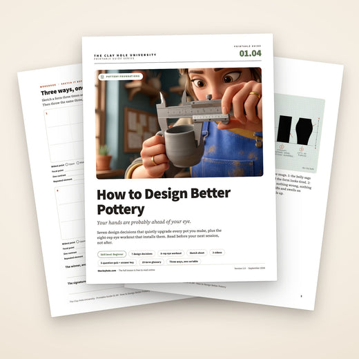
Videos come out as a labeled box with the title and channel to search for, since paper does not play them.